Remixing Key Creation
I revamped a product workflow, simplifying a core software experience for multi-family property owners: providing new keys to apartment residents.
Key Highlights
Goal
Design an experience that requires low learnability
Improve the satisfaction with the workflow of making keys
Role(s)
Lead Interaction Designer
(software + hardware)
Deliverables
Wireframes, audio sounds
Timeframe
8 weeks
Success Measurements
Decrease time of system learnability
Increase success of key creation
Improve hardware feedback

OVerview
The Project
Imagine you run a multi-family property building with 50+ units, everyone has the same key for the pool, Then someone makes a copy, and now everyone has access to your pool. The list of security concerns for both your residents and even the unwelcome guests inflates faster than an inner tube. Now you have to rekey the pool, and get everyone a new one. Oof.
I worked on an Allegion product called Zentra that was focused on providing a best in class access control software platform and hardware for multifamily property owners, making managing the above process less painful.
Zentra aimed to serve two types of customers: those with ordinary mechanical lock and key, & some with existing electronic locks on their doors. Both types of keying processes are costly, inefficient, and in many ways not insecure.
Mechanical: Each time a resident moved out of an apartment, the door locks would need to be manually turned over by swapping out the inner lock cores, and new keys distributed.
Electronic locks: Many places with e-locks already installed required multiple systems & multiple key types; and what's worse, the software was hard to use.
My job in this remix was to make ensure Zentra's core workflow was simple enough that anyone on the street to do it.
Who were we trying to serve?
There were 2 personas that this workflow would impact. We reviewed this existing data to remind us of what to keep in mind as we worked toward solutions.

Success Looks Like: Ensuring the best possible experience for residents, managing third party services, and decreasing Net Operating Income (NOI)
Pain Points: Multiple systems for access management and training to them, resident lock-outs

Success Looks Like: Return on Investment (ROI) for property, leased up buildings, and resident security
Pain Points: Lots of travel between sites, turnover and staff training, different softwares at individual sites to cover unmet needs.
Why did design matter in this project?
One word: Risk. If you want to build a best in class experience, you need to know what is and isn’t serving your customers right now. The product team didn’t feel like we had that, so we did a cognitive walk through with some experts, and decided quickly that designing concepts and gathering customer feedback would need to become a priority.
experience
What wasn't working?
The team chose to benchmark success against another existing competitive software in-use. After observing this workflow in action, and viewing available internal data, we determined a few core pain points:
Of attempted keys made, 15% failed. This was due to both hardware & software issues.
High Learning Curve
Property owners saw their time drained trying to upskill hires or paying 3rd party consultants.
Poor system feeback
It's hard to know where you stand if you aren't given a notice of success or failure.
Low Affordances
Multiple primary buttons, poor contrast, and a clunky workflow we in abundance
The problem statements
As a property manager
When a resident signs a lease
l want to give them access to their apartment
So that they can move in
But making their access has a lot of particular steps and I don’t always remember what I need to do
Property Owner
As a property owner
When there's a new hire managing my property
l want to not have to spend a lot of time training them
So that I can focus on dealing with other projects at other properties
But the tools we have in place are complex and I don’t always have time to dedicate to upskilling them
Internal challenges
Not only did we have customer problems to solve, there were a couple of challenges we faced inside as well:
Timing was less than ideal
Firmware releases for hardware are only released once every 6 months at the company. This is due to an organization wide structure. For us it meant that whatever was passed on for development would be in production for that long. Stakes felt higher, and intentional design to be learned from was critical here.
Too Many Cooks
This project required a lot of enterprise-wide knowledge and expertise in a very short amount of time. Hardware and software teams work in different silos across the organization. Finding ways and time for everyone to stay on the same page felt impossible. We solved communication issues by agreeing on an established source of truth, which was our experience brief, outlining the intended workflow for the user base.
Hypothesis
We believe that by providing an experience for creating resident access that utilizes more reliable hardware, provides adequate feedback, and a simpler process, would result in a more reliable (<5% failure rate) and a usability score (>3.5/5)
INterface
Adding a resident
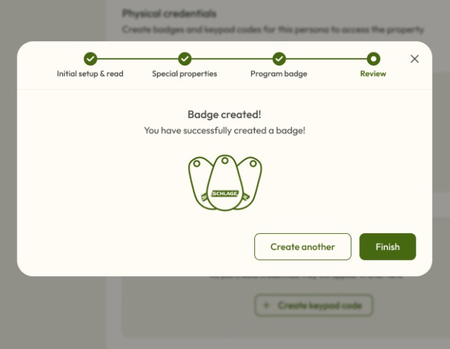
I designed a workflow that accounted for the overall job to be done of giving a resident access. The design’s intention was centered around one word: assurance. It starts with adding someone to the system.
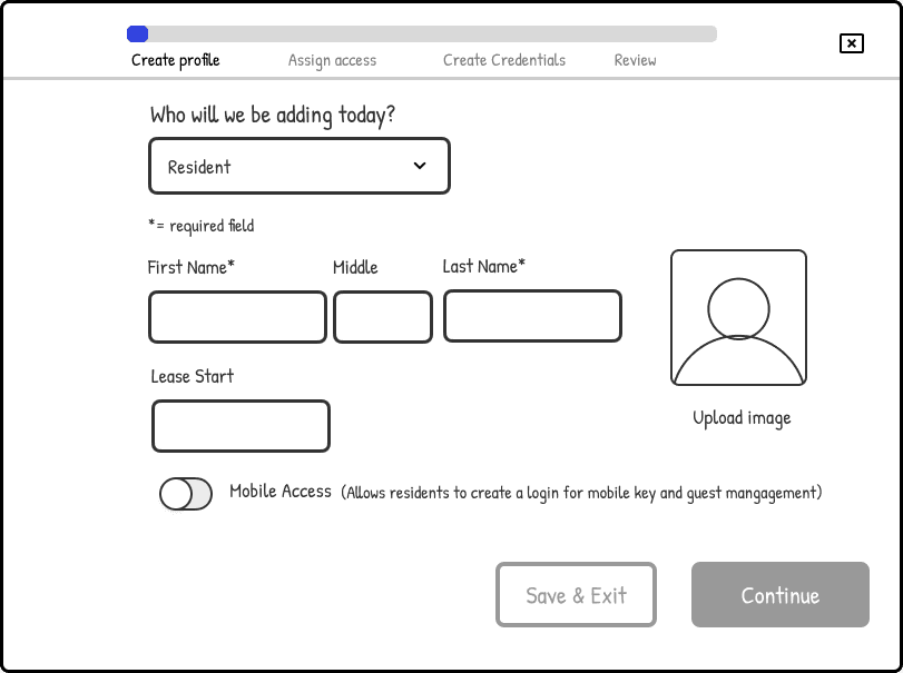
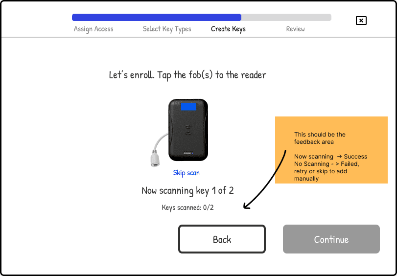
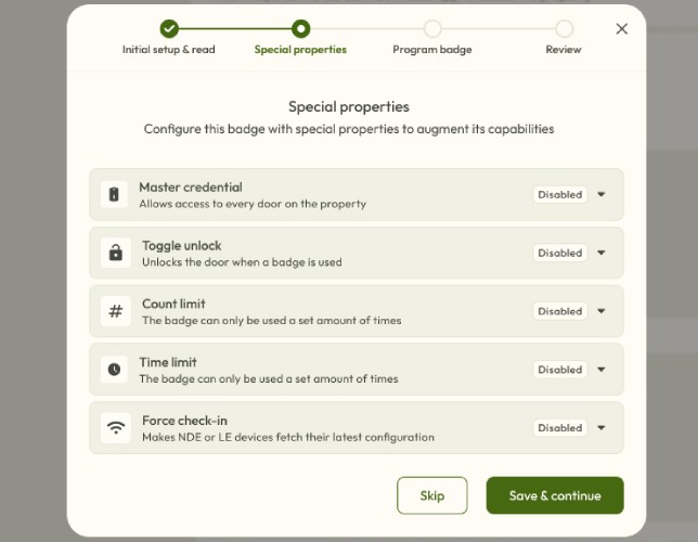
Making the Key
Due to technical constraints, there needed to be a lot of steps. We decided to separate the workflows of creating users from creating keys because of how complex the key creation steps needed to be.
If you want to go fast go alone, if you want to go far, go together
Another Road Bump
We needed to also create the hardware feedback sounds and sights to match the process designed with the screen experience.
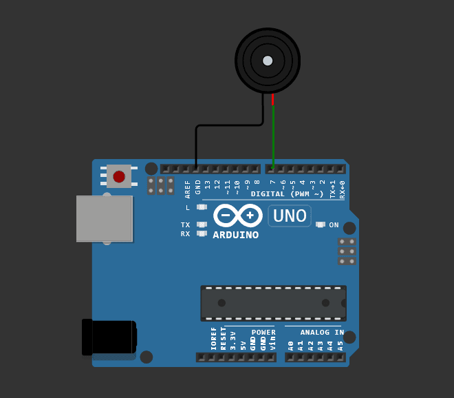
I would consider this to be the most challenging portion of this project. I worked with an industrial design partner to implement some best practices that we could apply to the hardware that would work alongside the software. I was given an excel spreadsheet of (specific) tones, but had no hardware to test the sounds with. But this is where I got creative.
I found an online arduino simulator I could use to code the tones that could closely mimic the success and failure sounds. For all intents and purposes, it worked.
Results
Feedback
After preparing the rough prototype to test, we put a sample in front of 5 random people to understand if the hardware sounds, colors, and software screens matched a common mental model good enough for helping anyone understand how to create a key. Here's the scores:
4.5/5
desirability
4/5
usability
* reliability would be measured at a later time post launch
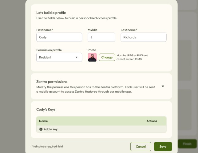
Adding some polish
Here's a click glance of where things landed after the dust settled.


Reflection
Looking Back
The juice was worth the squeeze
We spent about 3 weeks of design time, and 2 sprints worth of engineering time. The cost of development was about 50K all in to put out a product the team felt confident about. That might not sound like a lot, but investing that much in a core workflow was money well spent, especially when it’s something customers would have to use without changes for 6 months.
Cross-pollinate teams for more opportunities
Design and research worked with a partner in Industrial design, and one of the outcomes of that partnership was a recommended change to the default hardware to change the LED feedback colors of red and green since that color combination posed an accessibility risk to those with red/green color blindness.
Design for the whole
Creating this experience required thinking not just about the digital screens and steps, but also the physical aspects including auditory and visual. I embraced the challenges that came with it.
Credits: UI - Nick Richardson; Research - Ginger White