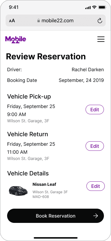
Car Share Platform
The purpose of this project was to concept a mobile responsive car sharing platform that would provide users a frictionless reservation process and administrative management.
Key Highlights
Goal
Enable smooth reservation and management of vehicles
Role(s)
UX, UI, Research
Deliverables
Wireframes, hi-fidelity screens
Timeframe
5 weeks

OVerview
The Project
The City of Madison provides a fleet of vehicles for employees to use for work and carpooling, however their current reservation system had a number of pitfalls including not having an elegant way to swap reservations, housing physical keys in multiple locations, and poor administrative oversight. Furthermore the city was intending to upgrade their vehicles to a new electric fleet;
I worked as a designer on behalf of Mobile22, a Mobility-as-a-Service provider, seeking to pilot a car sharing platform with the city.
The car sharing platform would serve as an initial solution to the reservation and administrative problems by addressing reservation failures, keyless operation, and improving communications to users. Mobile22 intended to partner with a third-party software company to provide the a keyless entry, telematics, and vehicle operation.
Defining Scope
There is a lot of raw potential with a car sharing platform being built from the ground up especially in future opportunities, however working with leadership and stakeholders, the following minimum requirements were defined:
Platform users can reserve, edit, and swap car reservations
More communication
Provide SMS communications and updates regarding reservations
Administrative oversight
Allow administrators to add, remove, and edit vehicles & garage locations
Record keeping
Give administrators access to reservation records and fleet visibility
Experience
Preliminary Research
Before we made any changes, we wanted to understand what wasn't working today.
Our team met with the city’s car share administrator, who gave a demonstration of the booking system and her typical day to day tasks; we recorded the interview, which became instrumental in defining how we could improve the experience and allowed us to remain empathetic to the users.
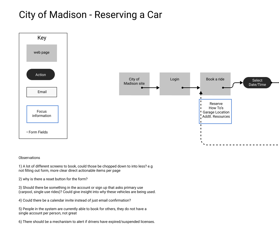
We mapped out the current user flows for booking and changing reservations located major pain points. It quickly became clear that the each interaction in the process had really low affordances, and the booking process was oddly chunked a part and not cohesive.
Gaining Alignment with Personas
After doing research, I worked on creating proto-personas with our team as an alignment exercise to make sure everyone was on the same page. Our identified personas were a city employee, and a fleet administrator.
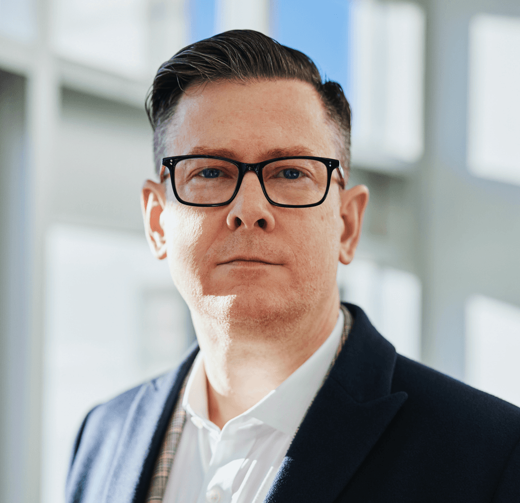
Toby - City Employee
Toby is an active community member and city employee looking to carpool with others from the far east side of Madison to downtown. He first heard about carpooling over lunch with coworkers. He is seeking a rotating schedule with others to reduce the time he drives weekly.
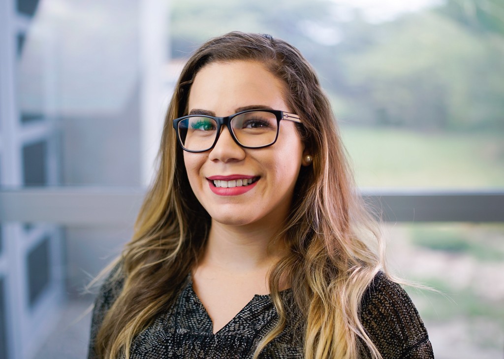
Rachelle - Fleet Admin
Raquel is a city car fleet administrator. Daily she manages the vehicles, garage locations, and manual re-schedules of reservations. She often has to reach out to drivers to let them know a vehicle is no longer available
Challenge yourself to be uncomfortable; it's what leads to growth
Trying Something New
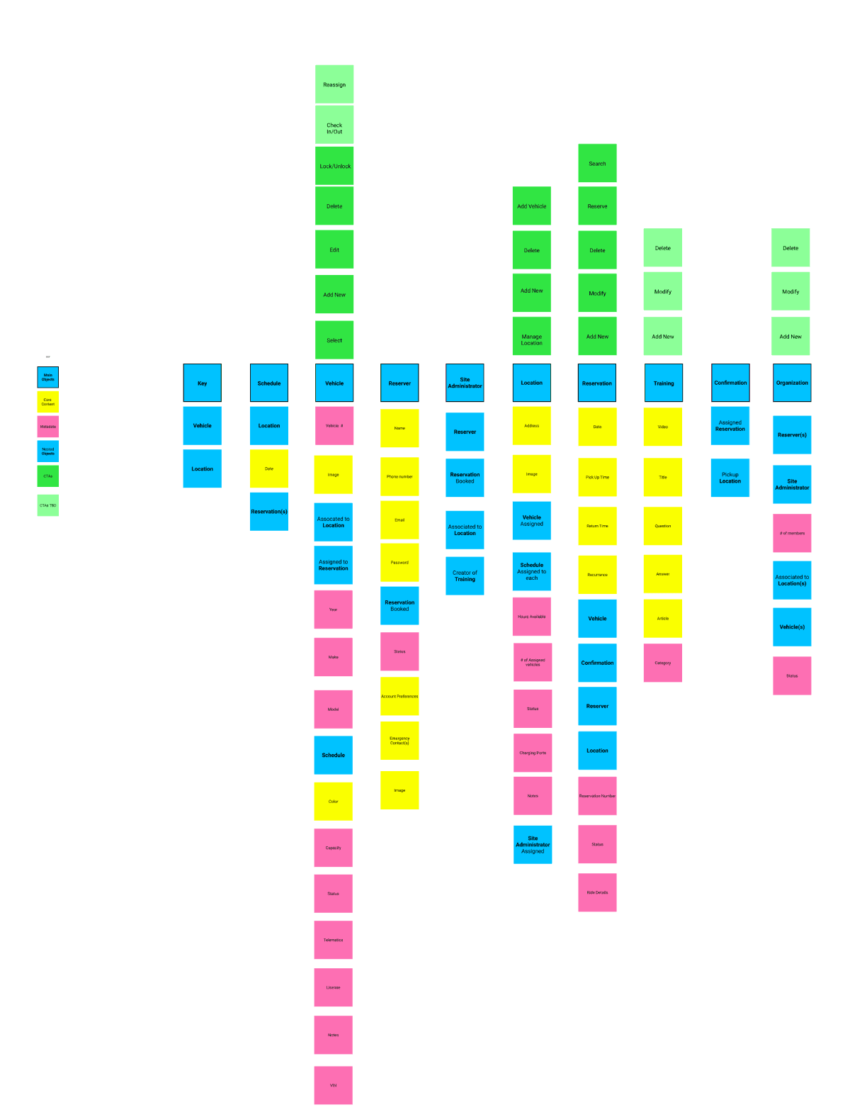
I also worked with a more senior designer to create an OOUX board for this project (object oriented user experience). What’s most helpful about OOUX is that it helps define the objects that users will interact with, as well as the objects that surround the problems they face.
Not only was it helpful for architecting a better experience, it was also helpful for working with developers to help them understand objects and components they might build.
Interface
Proofing Out the Concept
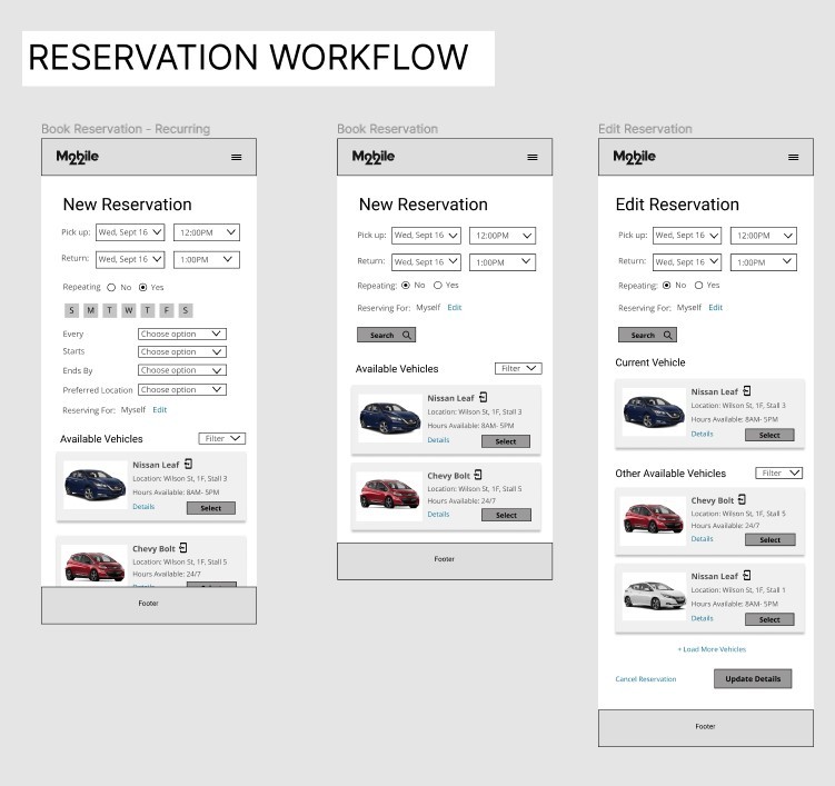
With research accomplished, wireframes were created to concept the improved workflows. The laid groundwork of the personas, OOUX, and recorded user interviews helped make every decision well thought-out and justified.
So What Changed?
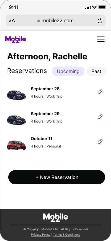
The booking process was simplified in a few different ways. First and foremost, by creating a home page that focused on one main thing: booking and identifying reservations. The current system made the user read through a wall of tips and information before finding the button for booking a reservation.
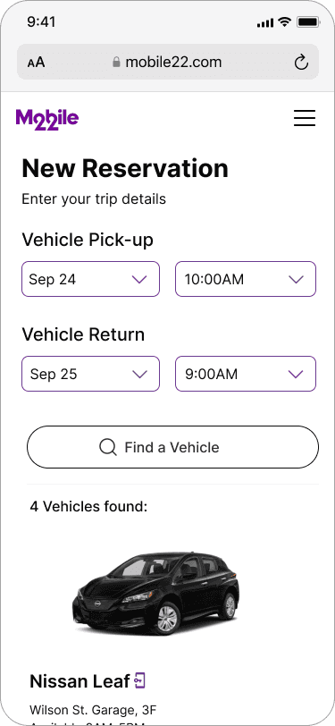
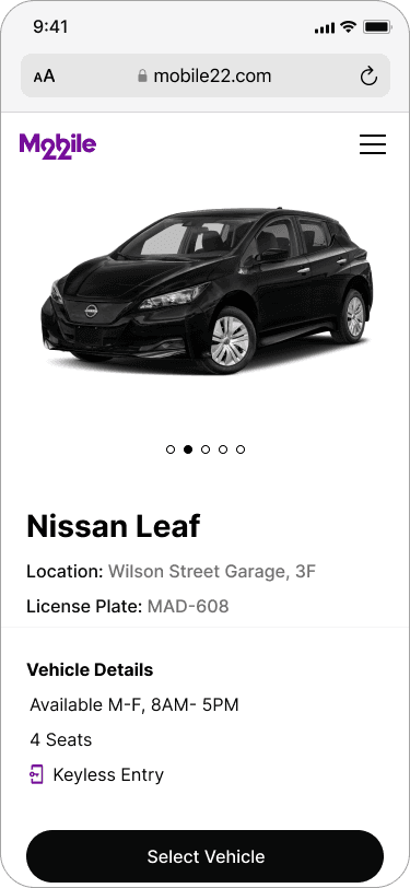
Secondly, I wanted to take the labor out of making a reservation. The solution: The user only needs to input a date and time and the platform would only return vehicles available for the time rather than make the user manually find a time to pick in their current system.
Make Administration Easier
For the administrative side, we noted that the city admin spent a lot of her time tracking down rides, vehicles, and locations, and in many instances, reassigning vehicles manually. In the proposed solution, that task was directly addressed by creating searchable records of all reservations, vehicles, and locations.
The platform would also manage re-booking and communication with the person who booked the ride, rather than require the admin to manually reach out and reassign. This could all be handled via a mobile interface
A Final Look
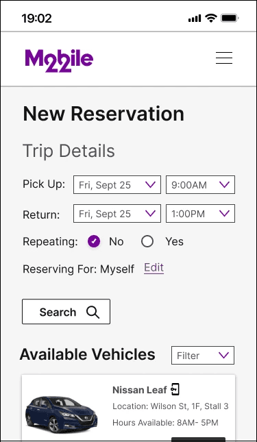
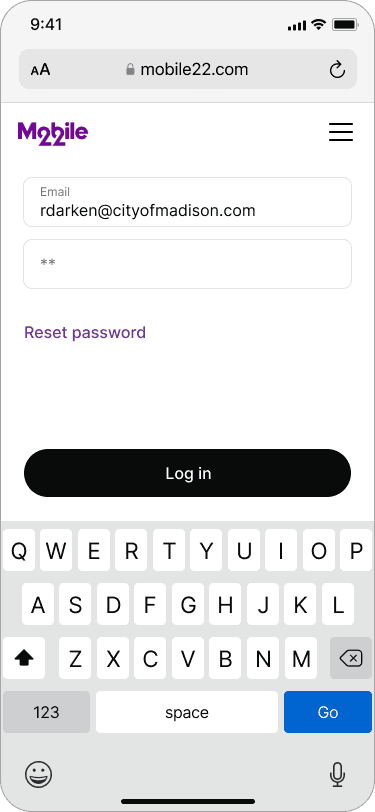
After working through the concepts and iterating with leadership and the product team, I worked on creating a few hi-fidelity visuals to showcase the reservation process in our presentation
"
This is going to solve what just happened
Rachelle, Fleet Administrator
Results & Reflection
Presentation & Final Thoughts
"This is Going To Solve What Just Happened"
5 weeks after the initial kickoff meeting I presented the work to the city that I had up until that point. This included a selection of 30+ low fidelity wireframes as well as 7 high fidelity mockups that highlighted the dual solution for car reservers and administrators. The solution was well met, because it directly addressed the core issues that were vocalized, including some that were not.
During the meeting, the audience asked us to hold for 3 min. They were taking a call with someone that needed to swap a reservation, which the current system was unable to do. It was really powerful to hear that they were looking forward to piloting with the proposed solution because we got to hear “This is going to help solve what just happened.”
Research Pays in Dividends
One of the main conclusions that I come back to with this project is how much more streamlined the design process is down the road with research. Much of the iteration that was done on this project were small pivots rather than big turns. Because time was well spent planning personas and conducting user interviews, we were ultimately able to zero in on pain points rather than assume pain points to solve.
Collabortion is Important for the Process
This project was worked on during the Covid-19 pandemic. Working remote for some team members had become a frustration for staying aligned on progress and ideating. I did my best to remedy this by utilizing online collaboration tools such as Miro for group whiteboarding, and Figma, for commenting on designs as they progressed and keeping others in the loop.
Although I was the primary lead on the design, it was a team effort between UX, Product, Leadership, and the city stakeholders to actualize the solution.
Looking for more?
Check out some more of my work or learn more about who I am.
